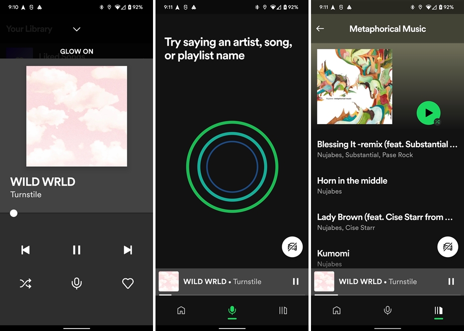
On the surface, Car Mode looks just like the usual Spotify UI only with most elements enlarged. The search button at the bottom is replaced with a microphone button for voice controls. Basic a change as it is, it’s probably all that’s needed as a much better implementation of a driving mode compared to the highly restrictive Car View. The player view is also vastly improved with minimal changes to the default view. Naturally, elements that are bigger makes it easier to identify and tap on what you want with a shorter glance. While the “like” button is still there, the “hide” button is gone, replaced instead with the “shuffle” button. The best thing about Car Mode is that, with a floating button on the home screen, it’s easy to revert to the default if you still prefer it. All that being said, according to 9to5Google, Spotify is still in the midst of testing the mode. That, and it looks to be an Android-only test for now. (Source: 9to5Google)
